
Highlights §
- So I optimize my setup to showing really, really good letters. A good monitor is essential for that. Not nice to have. A MUST. And in “good” I mean, as good as you can get. These are my thoughts, based on my own experience, on what monitors work best for programming. (View Highlight)
- Why is this a problem? Because the only way to get good letters is by spending more pixels per letter. That simple. In the past, the displays’ pixel count was small, so we learned to live with that and even invented some very clever tricks to make our lives better. The two important things to understand are:
• Times of low-resolution displays are over. High-resolution displays are a commodity now.
• Tricks developed for low-resolution displays didn’t magically make text look good. That always was and still is impossible. They just made text slightly less terrible, but it still is terrible.
If you think that you can somehow make your 1080p display render good text, that it just needs a few more tweaks, NO. This won’t happen. The sooner you accept that the sooner you can start looking for real solutions.
To make my claim better founded, let’s look in detail how text really looks on a low-resolution display and what can be done about it (spoiler: not much!). (View Highlight)
- First, there are simply not enough pixels to draw a letter. Let’s take Consolas, a font that was developed specifically for programmers. Microsoft worked really hard to fine-tune it for low-resolution rendering. We set it at 14px, which is default in VS Code (and people often go lower than that!): (View Highlight)
- On that size, capital letter B takes up mere 6×9 pixels on a screen. Lowercase letters only have 7 (seven!) vertical pixels to work with. That’s NOT MUCH. I have more fingers than that. No matter how good font is designed, it’s hard to show anything when all you have is seven pixels. Anything slightly more complex than “T” or “H” becomes an illegible pixel mess. (View Highlight)
- To fight the problem of everything being a gray mess, Windows uses pretty aggressive hinting. Basically, it just bends and moves letter strokes to the nearest pixel, ensuring more crisp boundaries.
And it works! Fonts do look better with hinting than without it:
 (View Highlight)
- Don’t get your hopes up though: it’s still a mess. It doesn’t make text look good. It makes it look better, but it is still bad.
The main problem with hinting, though, is that it destroys letter shapes. Pixels are rendered not where they are supposed to be, but rather where pixel grid happens. To give you a taste:
 (View Highlight)
- I’m not sure what the default value for it is these days, but make sure it’s OFF anyways.
UPD: Based on the feedback, seems that default value for it is ON. Be sure to switch it OFF!
That preference name is misleading. It used to be called “LCD font smoothing”, which suggested subpixel antialiasing. But Apple removed subpixel antialiasing from macOS in 2018, the same month it retired its last non-retina laptop.
The other thing the name suggests is that your fonts might not be smoothed at all. This is not the case either. (View Highlight)
- So, why would you want it off? Because there’s no automated way to make font bolder. Normally each font weight is carefully designed by a professional type designer. It’s a tricky process that involves millions of constraints. If you try to simulate it by, for example, adding an outline to the letter, it will look terrible:
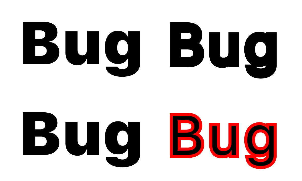 (View Highlight)
- But that’s exactly what “Font smoothing” in macOS does! Here’s another example. MacOS blurs pixel-perfect boundaries with “font smoothing”:
 Imagine a font designer who carefully balanced every letter, placed each point down to 1/100 of the pixel, only to be ignored by dumb software that thinks it knows better. (View Highlight)
 This will make everything on the screen slightly bigger, leaving you (slightly!) less screen estate. This is expected. My opinion is, a laptop is a constrained environment by definition. Extra 15% won’t magically turn it into a huge comfortable desktop. But at least you can enjoy that gorgeous screen and pixel-crisp fonts. Otherwise, why would you buy a retina screen at all? (View Highlight)
- Let me express an opinion. This is my blog, after all. I think that laptops are not good for development. They are great in mobility and convenience, and this argument might outweigh everything else for some people. I accept that. But still, a desktop monitor + external keyboard are always better than a laptop. There might be other reasons for not buying a monitor, but having one, I hope, no one would argue it’s a superior dev environment. (View Highlight)
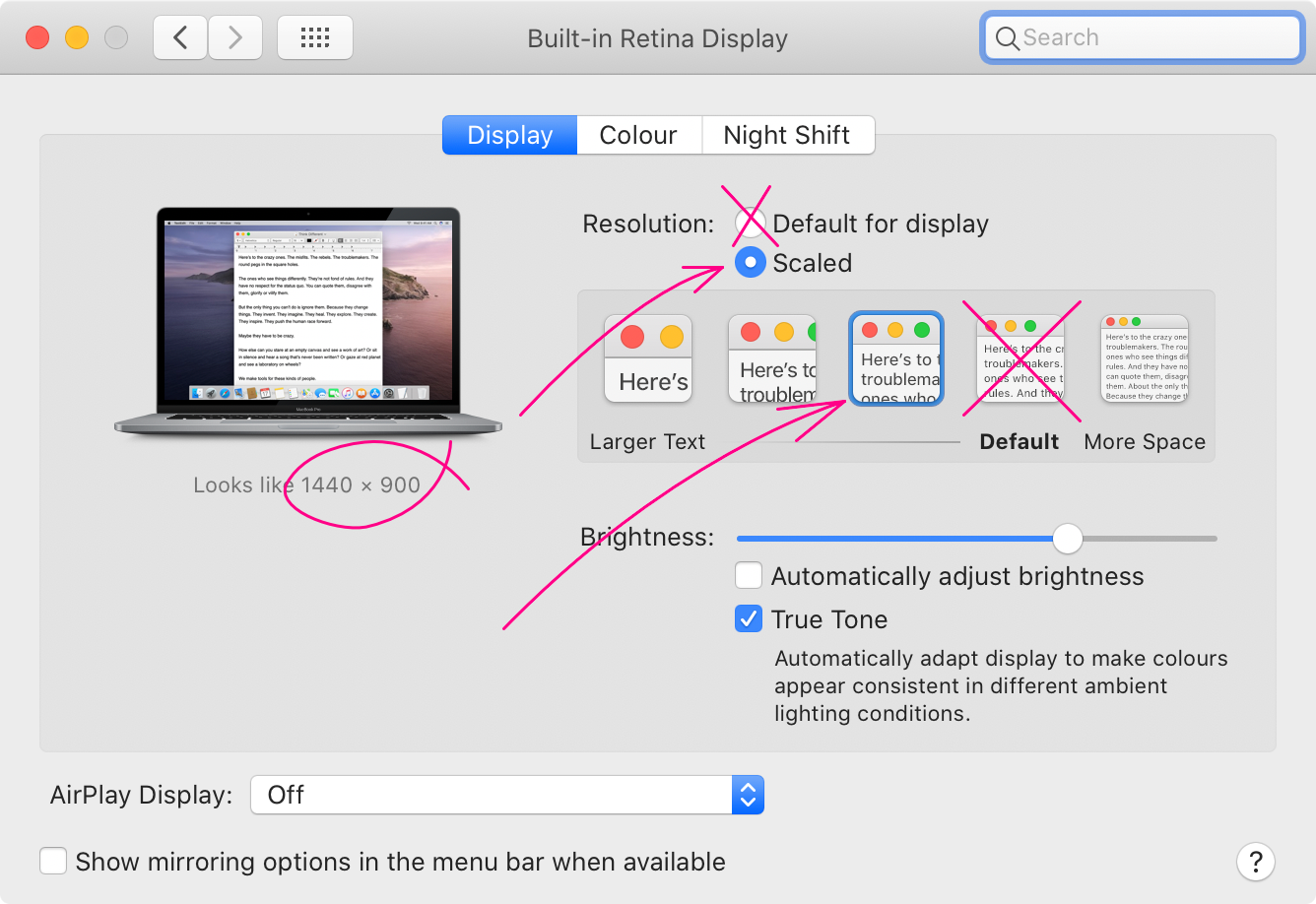
- With this out of the way, the question arises, which monitor should you get? From what we already discussed, two things should be clear:
• It needs to be at least a 4k monitor. Both 5k and 6k are also great, of course.1
• You need to use the integer scaling factor. (View Highlight)
- That means, if you have a 4k monitor (3840×2160), and use 2× scaling, you’ll get an equivalent of 1920×1080 logical pixels. So it’s a basic 1080p monitor in terms of how much you can fit, but with much crisper UI and text in everything.
Now, it might be tempting to use, for example, 1.5× scaling. That would give you an equivalent of 2560×1440 logical pixels, which, you might think, is much better. This is not how you should use it! The idea of a 4k monitor is NOT to get more pixels but to get the pixel-perfect, high-density UI rendering. Otherwise, a normal 1440p display would work better. A simple rule to remember: pixel alignment outweighs everything else. 1440p display is better at displaying 1440p content than 2160p display is at it. (View Highlight)
- To sum things up, I don’t see a problem with 24” 4k displays or even 27” displays. I use both with macOS and love both, never had any problems. Of course, 5k or 6k would be better, but those go in the “nice to have” category. 4k is a must-have, an absolute minimum for anyone working with text. (View Highlight)
- The world used to be divided into two camps: high-resolution displays and high-frame-rate displays. The former was good for text, latter for gaming, with no middle ground in between. If you like to play competitive games, buy both (and a large table). Gamers had no use for 4k displays since no reasonable game would run at 4k @ 120Hz, and the creative professionals had no use for 120 Hz in photo/text editing. I was in high-res camp since 2014, of course, and would never trade retina text rendering for barely noticeable refresh rate upgrade. (View Highlight)
- If you, like me, work with text, you might think that you have no use for 120 Hz. And you would be right. This falls into a “nice to have” category, but if you are looking for ways to improve your experience, this is a great way to do it. (View Highlight)
- 120 Hz gives you a couple of significant improvements:
• Animations are smoother, up to the point where they start to appear like a continuous motion instead of a very fast slideshow.
• Scrolling is very smooth in particular. Browser, code editing, to name a few.
• The whole system feels much more responsive.
• You can play games and work on a single display. (View Highlight)
- You’ll notice that everything is poorly animated, but also way less responsive. This is because the time between monitor updates is now 32 ms instead of 16 ms at 60 Hz. That means that whatever you do (press a button, move a mouse), the closest moment in time computer might start displaying the result might be as far as 32 ms away.
32 ms is a long time and easily perceivable. On 60 Hz, that time is cut in half: the longest you need to wait is just 16 ms. On 120 Hz, this is time is cut in half again: from 16 ms to 8 ms. In absolute numbers, you lose an additional 8 ms, which means going 60 Hz → 120 Hz is about half as impactful as going 30 Hz → 60 Hz. Still, something to go after, in my opinion. (View Highlight)
- Acer Nitro XV273K (View Highlight)
- • Text can’t be made look good on low-resolution displays.
• High-PPI displays are now a commodity, it’s time to switch.
• Laptops are ok, but a standalone monitor is always better.
• 4k monitor only makes sense with 2× / 200% scaling.
• If you want to go further, there are now affordable 4k @ 120 Hz options. (View Highlight)